




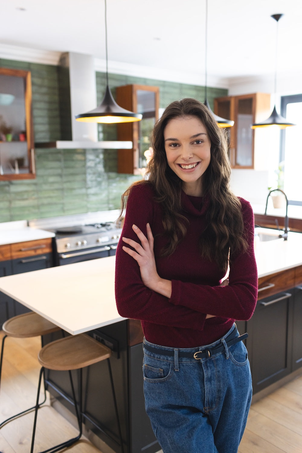
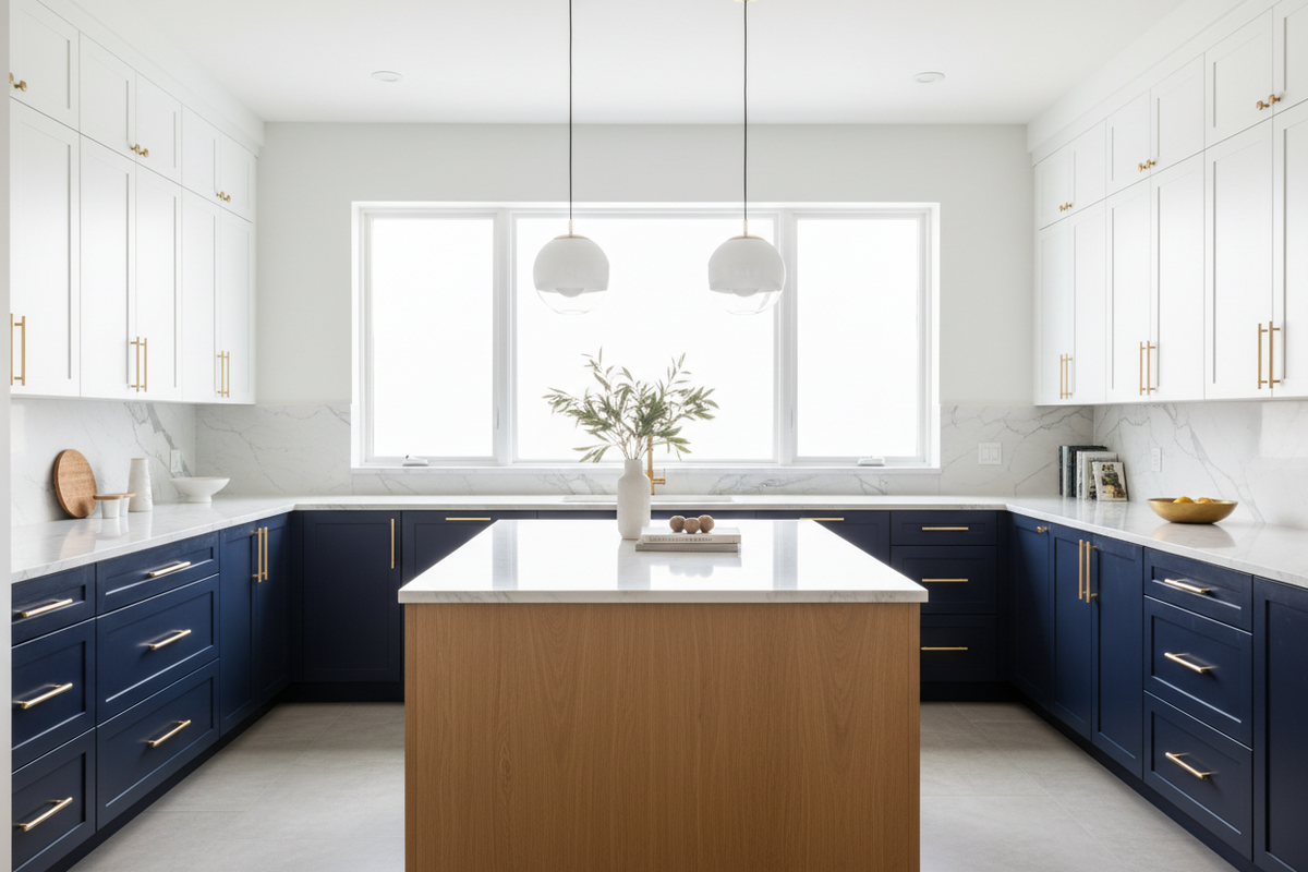
The all-one-color kitchen has been the standard for so long that homeowners walking into our showroom often don't realize there's an alternative. Same color uppers, same color lowers, same color island — that was the default through the entire 2010s. In 2026, the conversation has flipped. The most-requested kitchen layout this year isn't monochrome at all. It's two-tone: where the island, uppers, lowers, or accent zones each take a different color, creating depth, visual interest, and a kitchen that feels designed rather than ordered from a catalog.
We've installed dozens of two-tone kitchens across NJ and NY this year, and the pattern is consistent — clients who were initially nervous about the look come back excited about how much character it brings to the space. Here's how the two-tone trend actually works in 2026, the combinations that look intentional (not awkward), and how to avoid the mistakes that turn a sophisticated kitchen into a confusing one.
Why Two-Tone Took Over in 2026
Three forces converged:
1. Personalization fatigue with monochrome. When every kitchen on Pinterest looks the same — white shaker uppers, gray shaker lowers — homeowners started wanting something that felt like their kitchen, not a model home.
2. Open-concept floor plans needed visual anchors. As walls came down and kitchens opened into living spaces, a second cabinet color became a way to define zones without using a wall.
3. Manufacturers caught up. Brands like Fabuwood now offer the same door profile in several coordinated finishes, which eliminates the guesswork. Fabuwood Galaxy alone is stocked in ten colours here, so a two-tone scheme can use one door style throughout.
The Five Two-Tone Combinations That Actually Work in 2026
1. White Uppers + Wood Island
The safest, most universally flattering combination. Crisp painted white uppers (or warm bone) paired with a rift-cut white oak or walnut island. This combination dominates 2026 because it's both fresh and timeless.
Why it works: The white uppers keep the room bright; the wood island grounds it with warmth.
Best for: Almost any home style — modern, transitional, or classic.
2. Sage Green Lowers + White or Bone Uppers
The breakout combination of 2026. Sage on lower cabinets creates a sense of depth (heavier color anchored at the floor), while lighter uppers keep the room feeling open.
Why it works: Plays into the 2026 color palette without overcommitting to color.
Best for: NJ homeowners who want personality without going bold.
3. Two Wood Tones (Walnut + White Oak, for example)
A more sophisticated move: pairing two complementary wood species. Walnut island with white oak perimeter cabinets, or maple uppers with white oak lowers.
Why it works: Brings warmth to the entire kitchen while creating visual interest through grain and tone variation.
Best for: Contemporary kitchens, modern homes, and clients who want a fully natural-material palette.
4. Deep Navy or Forest Green Island + White Perimeter
The bolder move. A deeply saturated island (navy, forest green, charcoal) surrounded by clean white perimeter cabinets. High contrast, high drama.
Why it works: The island becomes a clear focal point. The white perimeter prevents the dark color from feeling oppressive.
Best for: Larger NJ kitchens (200+ sq ft) where the saturation has room to breathe.
5. Painted Perimeter + Stained Pantry/Display Cabinets
A subtle two-tone that many homeowners overlook. The main run of cabinets stays painted, but a single zone — a tall pantry tower, glass-front display cabinets, or a coffee station — switches to natural wood.
Why it works: Adds character without committing the whole kitchen to two colors.
Best for: Smaller kitchens where bigger two-tone might feel busy.
The 60-30-10 Rule for Two-Tone Kitchens
This is the framework we use with every two-tone client to keep the design intentional:
- 60% of cabinets: Primary color (usually the perimeter)
- 30% of cabinets: Secondary color (usually the island)
- 10% of cabinets: Accent color (usually a single tall cabinet or pantry)
When ratios shift too close to 50-50, the kitchen reads confused rather than designed.
Two-Tone Cost Reality (NJ/NY 2026)
| Project Type | Premium Over Single-Color |
|---|---|
| Same brand, two factory finishes | 0–5% |
| Same brand, one custom paint match | 8–15% |
| Two cabinet brands mixed | 10–18% (and harder coordination) |
| Custom two-tone with specialty finishes | 15–25% |
The good news: most two-tone kitchens from Fabuwood, Cubitac, or TSG come in at essentially the same price as single-color when you stick to in-line factory finishes from one brand. The savings come from sticking to the catalog rather than custom matching.
Common Two-Tone Mistakes
Mismatched undertones. A warm cream paired with a cool gray fights itself visually. When picking two colors, confirm they share an undertone family — both warm or both cool.
Equal proportions (50-50). Without a clear anchor color, the kitchen reads chaotic. Stick to 60-30-10.
Too many hardware finishes. Two-tone cabinets don't need two hardware finishes. Pick one (brass, matte black, brushed nickel) and use it throughout.
Forgetting the third surface. Cabinets are two-tone, but the counter is also a "color." A busy counter + two cabinet colors = three competing finishes. With two-tone cabinets, keep counters quieter (solid quartz or a low-veined quartzite).
Going too matchy. If your wall color, floor, and one cabinet tone are all the same warm beige, the kitchen loses its definition. Each finish should have its own moment.
Two-Tone in Smaller NJ Kitchens
A common concern: "Will two-tone make my small kitchen look smaller?" Properly executed, it does the opposite. Here's how to apply two-tone in compact NJ and NY kitchens:
Hoboken/Manhattan galley kitchens: White uppers, soft sage or pale wood lowers. The lighter top half visually raises the ceiling.
Brooklyn brownstone kitchens: Painted perimeter with a single contrasting tall pantry or pantry-style hutch. Adds character without crowding.
Small open-concept kitchens: Use the island as the second color. The contrast defines the kitchen zone within the larger space.
How to Pair with Your Existing Floor
The floor is the surface you can't change easily, so two-tone cabinet decisions need to respect it:
| Existing Floor | Best Two-Tone Pairings |
|---|---|
| Light oak hardwood | White + walnut island OR sage + bone uppers |
| Red oak hardwood (warm) | Cream + warm wood island OR mushroom + cream |
| Cool gray flooring | Bone + walnut OR white + deep forest |
| Tile (light) | White + sage OR cream + clay |
| Tile (dark) | Bone + sage OR cream + light wood |
Frequently Asked Questions
Q: Will a two-tone kitchen hurt my resale value?
Well-executed two-tone kitchens are now a resale asset in most NJ/NY markets. Tasteful combinations (white + wood, white + sage) appeal to most buyers. The risk is in overly trendy or polarizing pairings (like navy + bright yellow), which can limit your buyer pool.
Q: Can I add a second color to my existing kitchen?
Yes. Painting just the island a contrasting color is one of the highest-impact, lowest-cost kitchen refreshes available. A quality painter can repaint an island in a weekend for $800–$1,800.
Q: How do I pick which color goes where?
The general rule: anchor with the heavier color at the bottom (lowers or island), keep the lighter color at the top (uppers). Reversed combinations can work but read less naturally.
Q: Should my hardware match in a two-tone kitchen?
Yes, in most cases. One hardware finish unifies the two colors and prevents visual chaos. The only exception: when each cabinet zone has a clear architectural separation (like a pantry tucked into its own alcove).
Q: What countertop should I choose with a two-tone kitchen?
A single counter surface works best — it visually unites the two cabinet colors. Run the same stone across both perimeter and island. Mixing counters with two-tone cabinets is usually one variable too many.
The Bottom Line
The two-tone kitchen is the defining cabinet trend of 2026 — not as a flashy statement, but as a smarter way to bring character into a space that families spend hours in daily. The combinations that work are timeless: white + wood, sage + cream, two complementary wood tones, deep accent islands. The 60-30-10 ratio keeps proportions intentional. And when paired with quality cabinets from brands like Fabuwood or Cubitac, the cost premium over single-color is minimal.
If you've been hesitating to commit to a color in your renovation, the two-tone approach is the answer.
Home Craft Studio designs two-tone kitchens with carefully coordinated finishes from Fabuwood, Cubitac, and TSG. Visit homecraftstudio.com to explore combinations in our showroom.
Share:
Top 5 Kitchen Cabinet Brands for 2026: Fabuwood, Cubitac, TSG & More Compared
Japandi Kitchen Design: How to Achieve the Serene 2026 Aesthetic with the Right Cabinets & Tiles